Looking at the multimedia principle, I was interested in the different graphic types and the value and role they play when added to piece of written instruction. I am a very visual learner as well as someone who gets easily distracted and loses focus. The article discussed how each graphic type can work to engage when placed properly and at the right frequency but also how each graphic type can distract or generate confusion in the learning. In order to promote the best learning, a combination of texts and visuals is vital. It is more stimulating, improves memory and interest and when the message of the instruction is represented in multiple ways, it can help deepen the conceptual understanding. I think the Multimedia Principle when executed correctly (using appropriate, related and instructive visuals) enhances the delivery of the information and is a more productive and effective way of teaching and learning. It is useful in making the instruction feel more manageable or approachable. Looking a an excessive amount of text instruction can fell like an overwhelming stressful amount of information.
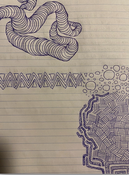
Connecting the concept of multimedia the Sketch Note tutorial also values visual representation. I loved this tutorial because almost all pages of my notes contain some sort of visual aspect, doodle or colour. In order to keep myself engaged in my learning and on track I always illustrate my notes with arrows, font changes outlines, boxes and even doodles around the side. I included some of my own “sketch-notes” and what I like to call “concentration drawings”.